
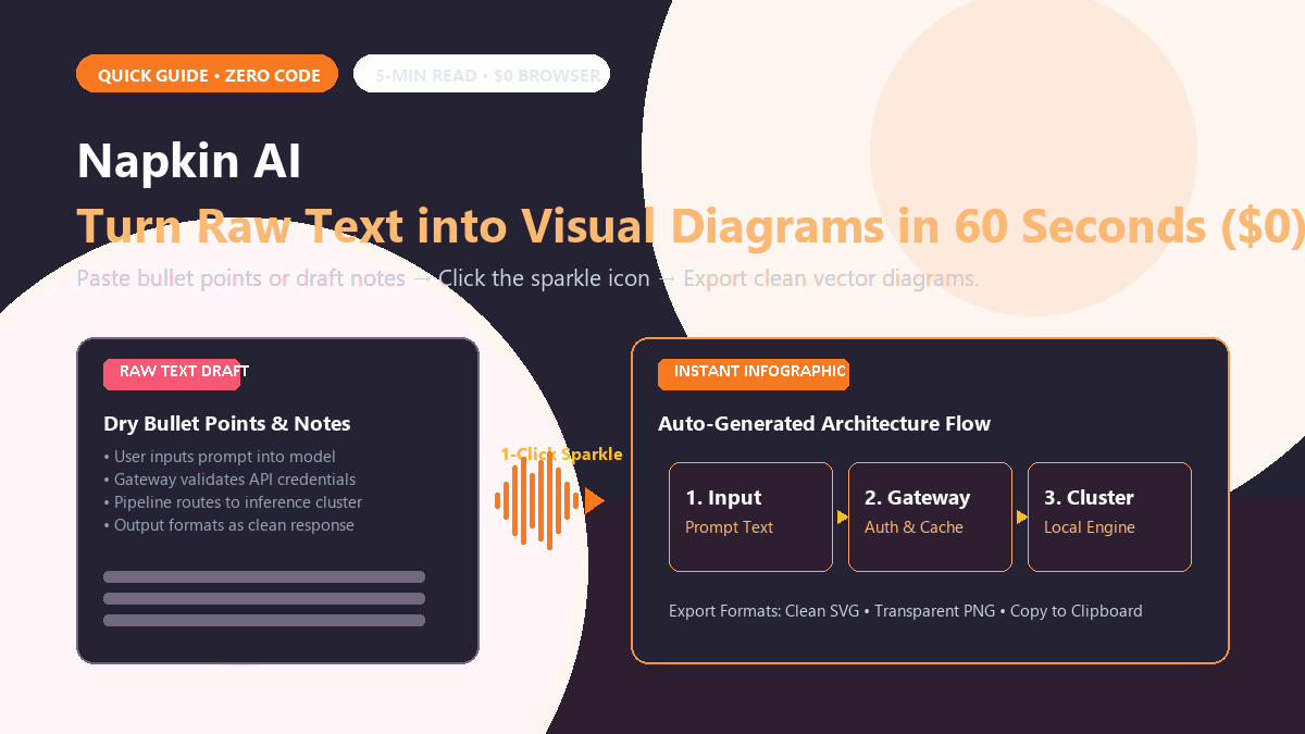
Turning a technical workflow, study summary, or project roadmap into a clear diagram usually means forty minutes wrestling with alignment grids in Canva or writing cumbersome Mermaid syntax by hand. Most people skim past dense walls of text, but designing custom graphics from scratch eats up an entire afternoon.
Heavy graphic design tools are overkill when all you need is a clean three-step flowchart, a comparative matrix, or a visual mind map to anchor an idea in the reader's head.
Napkin AI closes that gap completely. You paste your raw notes or rough bullet points directly into the editor, click the visual generation icon, and get crisp, editable vector infographics that you can drop straight into articles or presentation decks in sixty seconds.
The 3-Step Workflow
- Open napkin.ai in your browser. Create a free account using your Google login. You land on a clean, Notion-style text workspace with zero clutter.
- Paste your text or outline. Write or paste two or three sentences explaining a process, comparison, or breakdown (for example: "Input data is parsed by the API gateway, verified against cached tokens, and routed to an inference cluster.").
- Click the Sparkle Icon and Select Your Visual. Hover to the left of your text. A blue sparkle icon appears. Click it, and Napkin AI analyzes the sentence structure, generating several visual styles: numbered step flows, process arrows, or modular cards. Click your preferred layout, customize font colors or icons if desired, and click Download PNG/SVG.
The vector SVG export is clean and crisp, meaning you can drop it directly into blog posts, pitch decks, Google Docs, or Notion without fuzzy pixelation.
If you need organic, hand-drawn system architecture diagrams and software engineering flowcharts on an infinite whiteboard, check our 60-second Excalidraw AI guide.
Where It Falls Short
- Complex engineering architecture needs manual tuning. If your workflow contains ten conditional branches, nested database fallbacks, and microservice loops, Napkin will simplify it into a high-level conceptual diagram rather than a technical UML schema.
- Font and branding customization is basic on the free plan. You get access to several polished modern color palettes, but importing custom corporate typography requires upgrading to higher tiers.
- Requires clear sentence logic. If your text is disorganized or rambling, Napkin will produce confused diagrams. Feeding it short, sequential bullet points yields the cleanest visual results.
For slide decks, study guides, and blog visual anchors, Napkin AI saves hours of tedious graphic layout work. It turns ideas into visuals in sixty seconds flat.